Aiken Regional Unveils New Look
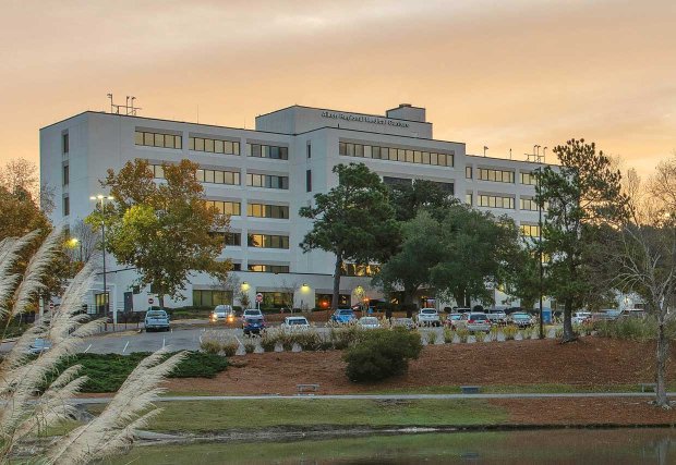
Aiken Regional Medical Centers, a 273-bed care facility, is celebrating the launch of its new brand with a new logo. The revitalization of the logo places emphasis on Aiken and the hospital’s connection to the local community.
“The decision to update our logo was not a light one,” said Jim O’Loughlin, Chief Executive Officer at Aiken Regional Medical Centers. “While ideas to update the look have been discussed in recent years, our impending plans to expand service lines and grow into neighboring markets are reasons timing was of the essence to introduce a new, fresh look.”
![]()
The design process took nine months and was a collaborative effort between the local team and corporate team at Universal Health Services (UHS). Both teams believed it was best to highlight Aiken Regional’s dedication to the local community and its commitment to providing high-quality patient care. The icon highlights the ‘A’ in Aiken; the fully capitalized and bright blue ‘AIKEN’ emphasizes the local community the hospital serves; and the swooshes symbolize continuity of care and are reminiscent of the swooshes in the old logo.
“Our new brand better reflects the patients we serve, the Aiken community,” O’Loughlin added. “Providing quality care to our patients is the center of all our efforts. We can only be successful with the continued support of our local community.”
The new branding will be visible where and how the community interacts with Aiken Regional — on the website, throughout social media, print, broadcast and in person. The new branding will also be adopted by Aiken Professional Association (APA) and Aurora Behavioral Health.